Verse Calendar Mobile Feature

Verse Calendar Mobile Feature

This project focused on bringing Suggested Times and Find a Time features from the HCL Verse desktop calendar to the mobile app. These enhancements aimed to provide users with a consistent scheduling experience across platforms, allowing them to manage their calendars seamlessly on mobile without needing to rely on the desktop version.

My Role

Product Designer

Team

Product Designer(Me), 3 Mobile Developers, 1 Product Manager

Year

2023

Duration

4 weeks

4 weeks

Problem Statement

Problem Statement

The Suggested Times and Find a Time features on the Verse desktop simplify scheduling meetings by providing smart scheduling assistance and reducing conflicts. However, these features were unavailable on the mobile app, leading to an inconsistent user experience across platforms.

This gap discouraged users from fully adopting the mobile app, as they were often forced to switch to the desktop version to access these critical features.

Problem Statement

The Suggested Times and Find a Time features on the Verse desktop simplify scheduling meetings by providing smart scheduling assistance and reducing conflicts. However, these features were unavailable on the mobile app, leading to an inconsistent user experience across platforms.

This gap discouraged users from fully adopting the mobile app, as they were often forced to switch to the desktop version to access these critical features.

Verse desktop 'Find a Time' and 'Suggested Times' (on calendar form)


Outcome

Outcome

The Verse mobile app was enhanced with Suggested Times and Find a Time features, ensuring consistent scheduling functionality across platforms. The features were carefully redesigned to optimize the layout and usability for smaller screens while maintaining their core value, offering an intuitive and seamless experience.

Post-deployment, the enhancements resulted in:

  • A 20% adoption rate for the new scheduling features within the first month.

  • An average 25% reduction in time spent scheduling meetings on mobile.

  • A 5% increase in daily active users (DAU) on the mobile app.

Outcome

The Verse mobile app was enhanced with Suggested Times and Find a Time features, ensuring consistent scheduling functionality across platforms. The features were carefully redesigned to optimize the layout and usability for smaller screens while maintaining their core value, offering an intuitive and seamless experience.

Post-deployment, the enhancements resulted in:

  • A 20% adoption rate for the new scheduling features within the first month.

  • An average 25% reduction in time spent scheduling meetings on mobile.

  • A 5% increase in daily active users (DAU) on the mobile app.

Reorganized Event Form with "Suggested Times"

Mobile calendar event form now includes a "Suggested Times" section, which provides the earliest available time based on the schedules of the meeting chair (the users) and invitees. Users can customize meeting duration and filter times that work for all invitees. The form was also redesigned for better readability and organization.

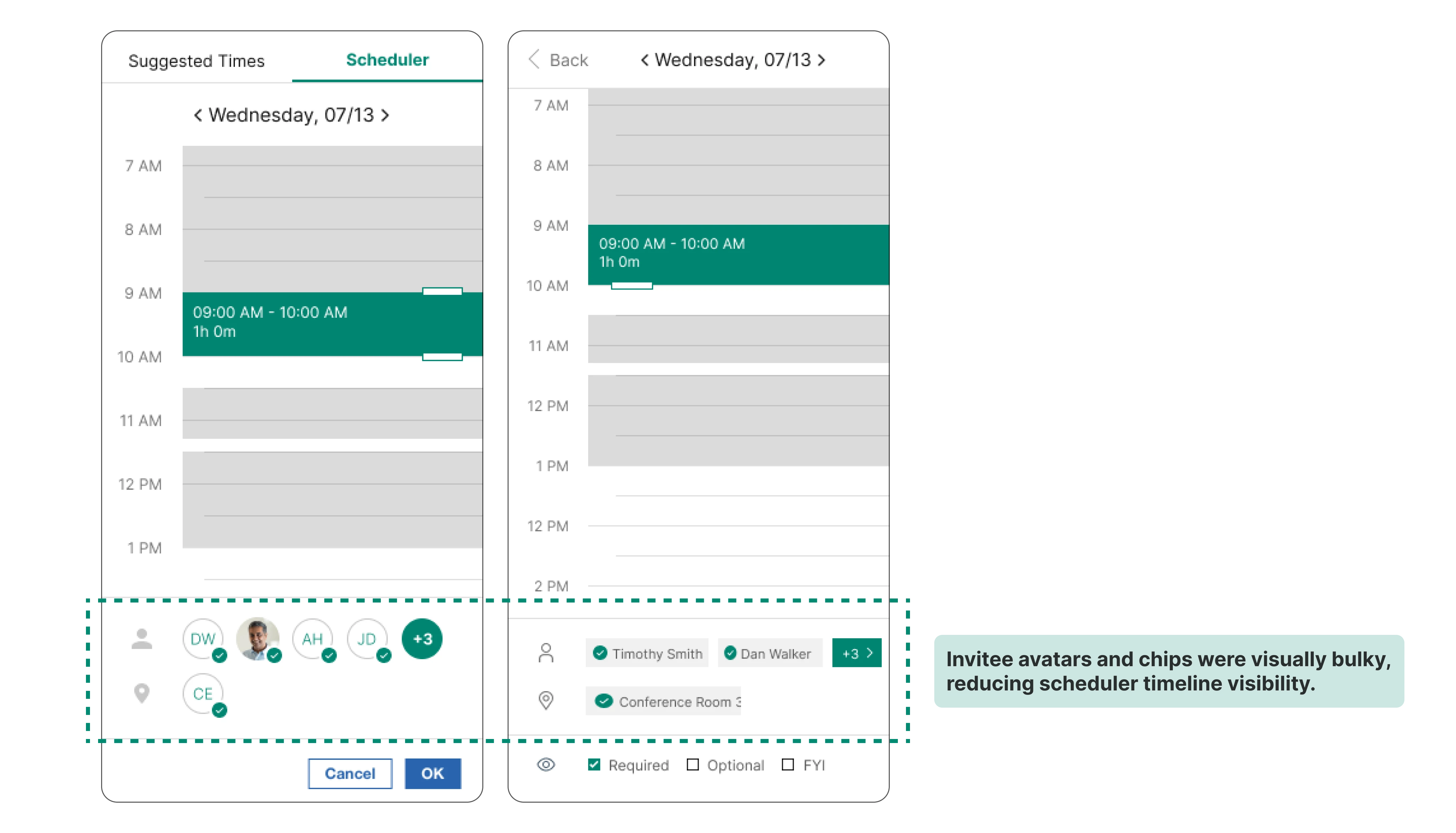
Schedule Visualizer for "Find a Time"

When users click the "Find a time" button, a schedule visualizer displays their calendar events alongside invitees' availability. By moving the timeline, users can instantly view availability, ensuring efficient scheduling.

Invitees Filter and List for Large Meetings.

For organizational meetings with numerous participants (30+), users can filter invitees to focus on the availability of key individuals, such as executives, ensuring priority scheduling.

Responsiveness

The feature was designed for both portrait and landscape orientations on mobile and tablet devices, providing full functionality regardless of screen size or orientation.

Process

Process

Process

Competitive Analysis

Competitive Analysis

To ensure seamless implementation of the web feature in the mobile environment, I analyzed how leading enterprise and operating system calendar apps handled similar functionality.

To ensure seamless implementation of the web feature in the mobile environment, I analyzed how leading enterprise and operating system calendar apps handled similar functionality.

Competitive Analysis

To ensure seamless implementation of the web feature in the mobile environment, I analyzed how leading enterprise and operating system calendar apps handled similar functionality.

Microsoft Outlook Calendar
  • Strength: Displays invitees’ avatars with availability for quick reference.

  • Weakness: Inefficient for large groups, requiring horizontal scrolling and lacking a clear distinction between required and optional invitees.


Google Calendar
  • Strength: Integrates scheduling tools within the event form for easy navigation.

  • Weakness: The interface becomes cluttered as the event form overlays the scheduler. This redundancy adds complexity without improving usability.


IOS Apple Calendar
  • Strength: Adapts a web-style schedule visualizer for mobile.

  • Weakness: Requires both horizontal and vertical scrolling for large groups, which is cumbersome in portrait mode, the default orientation for most users.

Design Iterations

Design Iterations

I held multiple review meetings with 4 internal users to gather feedback based on common user behavior and patterns. The iterative designs of the "Find a Time" scheduler shown below illustrate the feedback I received and the adjustments I have made.

I held multiple review meetings with 4 internal users to gather feedback based on common user behavior and patterns. The iterative designs of the "Find a Time" scheduler shown below illustrate the feedback I received and the adjustments I have made.

Design Iterations

I held multiple review meetings with 4 internal users to gather feedback based on common user behavior and patterns. The iterative designs of the "Find a Time" scheduler shown below illustrate the feedback I received and the adjustments I have made.

Challenges

Challenges

One of the primary challenges of this project was balancing simplicity in the interface design with the constraints of a mobile screen’s limited real estate. The desktop features relied on displaying complex data, such as multiple invitees' schedules and availabilities, which required thoughtful design to ensure both clarity and usability.

Additionally, translating interactive elements originally designed for mouse controls into intuitive touch gestures posed unique hurdles. This required rethinking layouts, prioritizing key actions, and conducting iterative usability testing to refine the experience.

Challenges

One of the primary challenges of this project was balancing simplicity in the interface design with the constraints of a mobile screen’s limited real estate. The desktop features relied on displaying complex data, such as multiple invitees' schedules and availabilities, which required thoughtful design to ensure both clarity and usability.

Additionally, translating interactive elements originally designed for mouse controls into intuitive touch gestures posed unique hurdles. This required rethinking layouts, prioritizing key actions, and conducting iterative usability testing to refine the experience.

Reflection

Reflection

This project deepened my understanding of adapting desktop features for mobile environments. I learned the importance of balancing simplicity with functionality, especially when working with limited screen space.

Through collaboration and iteration, I ensured that the final design was user-friendly, visually streamlined, and aligned with user needs. This experience reinforced the value of responsive design and the need for platform consistency in enhancing the user experience.

Reflection

This project deepened my understanding of adapting desktop features for mobile environments. I learned the importance of balancing simplicity with functionality, especially when working with limited screen space.

Through collaboration and iteration, I ensured that the final design was user-friendly, visually streamlined, and aligned with user needs. This experience reinforced the value of responsive design and the need for platform consistency in enhancing the user experience.

@Haewon Song Portfolio All rights reserved

Go Back To Top

@Haewon Song Portfolio All rights reserved

Go Back To Top

@Haewon Song Portfolio All rights reserved

Go Back To Top

@Haewon Song Portfolio All rights reserved

Go Back To Top