
HCL Verse Mobile
Calendar Scheduler
HCL Verse Mobile
Calendar Scheduler
Target Audience
Target Audience
Verse Android and
IOS users
Skills
Skills
Competitive Analysis
Wireframes
Design iterations
Prototype
This feature allows the users to check invitees' availability within their mobile app, ensuring intuitive and consistent user experience with the existing capabilities in the web environment.”
This feature allows the users to check invitees' availability within their mobile app, ensuring intuitive and consistent user experience with the existing capabilities in the web environment.”
Why this feature is needed? |
Why this feature is needed? |
Background
Background
In the earlier release of HCL Verse web, our team implemented ‘Suggested Times’ and ’Find a time’ feature on Calendar which intended to prevent the chair to schedule an event with conflict. After the release, many users requested the same feature in the IOS and Android app, so they can also prevent meeting conflict when they are not using the desktop app while traveling with mobile device.
In the earlier release of HCL Verse web, our team implemented ‘Suggested Times’ and ’Find a time’ feature on Calendar which intended to prevent the chair to schedule an event with conflict. After the release, many users requested the same feature in the IOS and Android app, so they can also prevent meeting conflict when they are not using the desktop app while traveling with mobile device.


Interface of calendar event form
Interface of schedule visualizer
Reference Research |
Competitive Analysis
Competitive Analysis
Since the focus of this project was to bring the web feature implemented into mobile app environment seamlessly, I studied how other companies implemented similar feature into their mobile app and the design tweaks they made for mobile environment. I evaluated 2 widely used enterprise calendar apps and 1 operation system calendar app.
Since the focus of this project was to bring the web feature implemented into mobile app environment seamlessly, I studied how other companies implemented similar feature into their mobile app and the design tweaks they made for mobile environment. I evaluated 2 widely used enterprise calendar apps and 1 operation system calendar app.


Microsoft Outlook
Microsoft Outlook
Strengths
Strengths
Outlook offers clear visual indicators when there are scheduling conflicts, making it easier to identify and resolve them quickly.
Outlook offers clear visual indicators when there are scheduling conflicts, making it easier to identify and resolve them quickly.
The app suggests optimal meeting times based on the availability of invitees, enhancing scheduling efficiency.
The app suggests optimal meeting times based on the availability of invitees, enhancing scheduling efficiency.
Outlook excels in synchronization across devices and platforms, ensuring a consistent and reliable user experience.
Outlook excels in synchronization across devices and platforms, ensuring a consistent and reliable user experience.
Weaknesses
Weaknesses
The extensive feature set can make the interface feel complex and overwhelming, particularly for new users.
The extensive feature set can make the interface feel complex and overwhelming, particularly for new users.
Its rich functionality comes with a steep learning curve, especially for those unfamiliar with the Microsoft ecosystem.
Its rich functionality comes with a steep learning curve, especially for those unfamiliar with the Microsoft ecosystem.

Google Calendar
Google Calendar
Strengths
Strengths
Google Calendar also prevents scheduling conflicts by checking participants' availability and displaying visual alerts, which helps avoid double-booking.
Google Calendar also prevents scheduling conflicts by checking participants' availability and displaying visual alerts, which helps avoid double-booking.
Despite offering a wide range of features, Google maintains an uncluttered and straightforward design.
Despite offering a wide range of features, Google maintains an uncluttered and straightforward design.
Weaknesses
Weaknesses
While some offline functionality is available, full access to features requires an internet connection.
While some offline functionality is available, full access to features requires an internet connection.
There have been reports of the app crashing or failing to sync events correctly across all invitees, which can disrupt planning and coordination.
There have been reports of the app crashing or failing to sync events correctly across all invitees, which can disrupt planning and coordination.


Apple Calendar
Apple Calendar
Strengths
Strengths
Apple Calendar is known for its clean and user-friendly interface, offering essential features for organizing schedules. It's easy to understand and use.
Apple Calendar is known for its clean and user-friendly interface, offering essential features for organizing schedules. It's easy to understand and use.
The app comes free with all Apple devices, providing a good range of basic features without any additional cost.
The app comes free with all Apple devices, providing a good range of basic features without any additional cost.
The schedule visualizer interface is optimized for landscape mode.
The schedule visualizer interface is optimized for landscape mode.
Weaknesses
Weaknesses
Compared to Google and Outlook calendars, Apple Calendar may feel limited in advanced features and customizations, especially for professional users who require more robust scheduling options.
Compared to Google and Outlook calendars, Apple Calendar may feel limited in advanced features and customizations, especially for professional users who require more robust scheduling options.
The app does not integrate well outside the Apple ecosystem, which can be a drawback for users who also use Windows or Android devices.
The app does not integrate well outside the Apple ecosystem, which can be a drawback for users who also use Windows or Android devices.
The interface for the schedule visualizer seems less mobile-friendly, particularly in portrait mode.
The interface for the schedule visualizer seems less mobile-friendly, particularly in portrait mode.
Process |
Design Iterations
Design Iterations
I conducted several rounds of design iterations for the schedule visualizer, working closely with stakeholders to ensure that the feature was clean, simple, and user-friendly. My goal was to create an interface that not only offered the best user experience but was also intuitive and efficient.
I began by creating wireframes that illustrated the basic elements of the visualizer. These wireframes included the timeline grid, action buttons, indicators of schedule availability, and the invitees' availability. These foundational designs helped to establish the core layout and functionality, which were refined through subsequent iterations.
Below are some highlights of the schedule visualizer design iterations I went through, along with the reasons why certain designs were not selected:
Invitees’ avatar with availability
took too much space.
Filter for the availability.
Decided to reduce the choice between only All vs Required.
Ability to manually
type in the time
Tabs to move between ‘Suggested Time’ and ‘Scheduler’. Later, I moved ‘Suggested Time’ to the calendar form so the user can select time without any extra tabs.
For this screen, it shows only
how many users are busy at selected time.
I wanted to show the each invitee’s availability.
However horizontal scrolling is not useful if there is invitee with very long name or long list of invitees.
Two types of availability indication.
Icon and Color.


For this screen, it shows only
how many users are busy at selected time.
I wanted to show the each invitee’s availability.
However horizontal scrolling is not useful if there is invitee with very long name or long list of invitees.
Two types of availability indication.
Icon and Color.
In the initial wireframes and early design iterations, I focused on minimizing redundant and unnecessary information to optimize the use of limited screen real estate on mobile devices.
For instance, I removed the check icon from the time grid because other visual indicators already conveyed whether the selected time worked for the invitees.
I also opted not to include the invitee filter—such as whether optional or FYI invitees should be considered when checking schedule availability—in the schedule visualizer screen.
This decision was made to reduce potential user confusion and optimize the scheduling process.
In a later iteration, the significant change I made was removing the manual time input feature.
This decision was made based on stakeholder feedback, which indicated that the users preferred an assistance in finding a suitable time within the schedule visualizer.
When the users manually selected a time, they intend to disregard the invitees' availability.
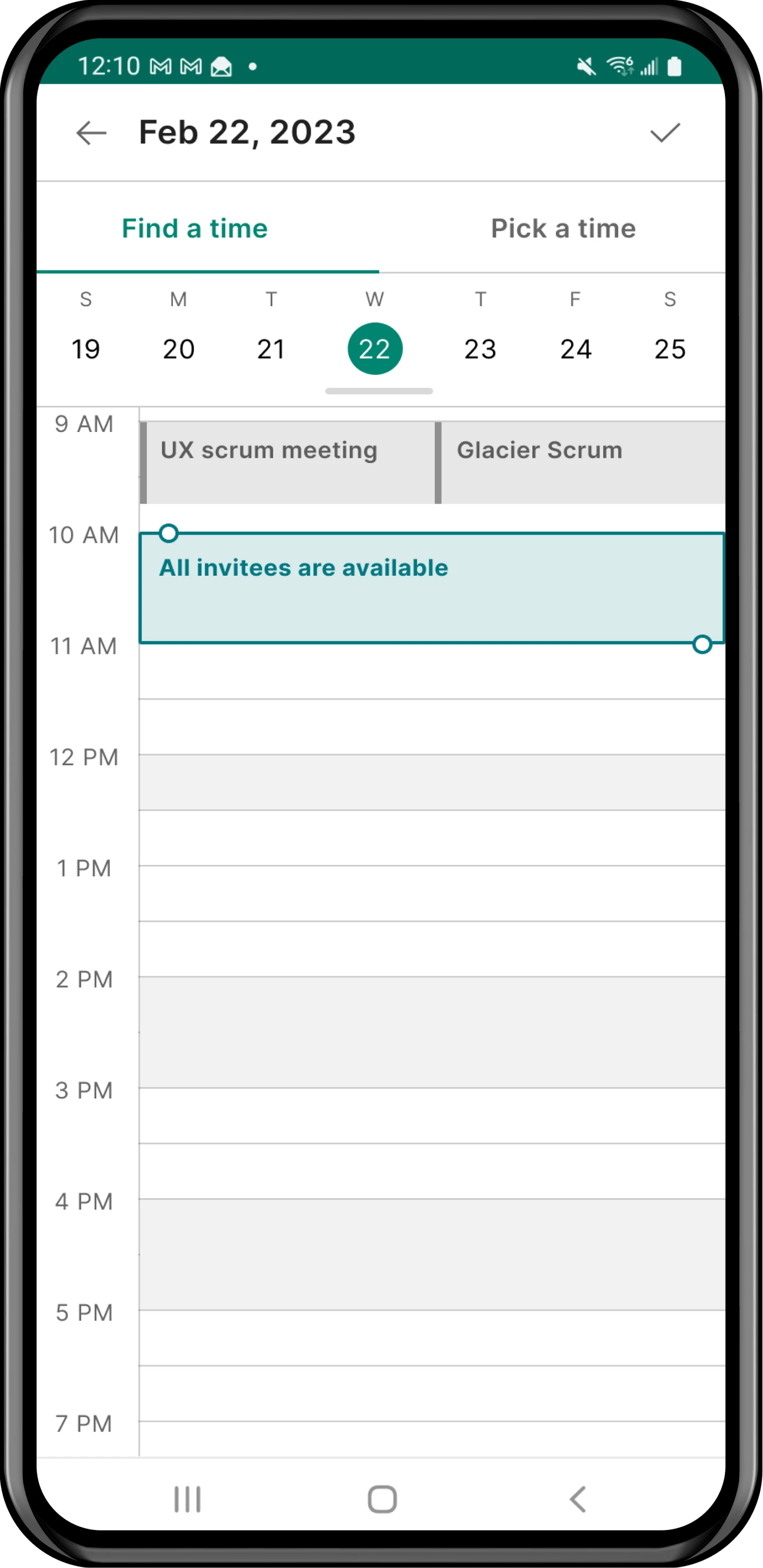
To address this, I introduced two tabs at the top of the screen: one for ‘Find a Time’ and another for ‘Pick a Time.’
The ‘Find a Time’ tab helps users automatically identify available slots, while the ‘Pick a Time’ tab allows users to manually select a time if desired.


Calendar carousel to easily move around the date
I got a feedback that manual time input interrupt the user work flow
Separated Schedule visualizer and manual time picker.
Ability to see invitee’s schedule data but the data is not available with the API Verse has.
I considered having the invitee list in the visualizer screen can be not useful but also interrupt user flow by attracting user’s eyes.
In a later iteration, the significant change I made was removing the manual time input feature.
This decision was made based on stakeholder feedback, which indicated that the users preferred an assistance in finding a suitable time within the schedule visualizer.
When the users manually selected a time, they intend to disregard the invitees' availability.
To address this, I introduced two tabs at the top of the screen: one for ‘Find a Time’ and another for ‘Pick a Time.’
The ‘Find a Time’ tab helps users automatically identify available slots, while the ‘Pick a Time’ tab allows users to manually select a time if desired.
Calendar carousel to easily move around the date
I got a feedback that manual time input interrupt the user work flow
Separated Schedule visualizer and manual time picker.
Ability to see invitee’s schedule data but the data is not available with the API Verse has.
I considered having the invitee list in the visualizer screen can be not useful but also interrupt user flow by attracting user’s eyes.
Feature detail |
Suggested Times
Suggested Times
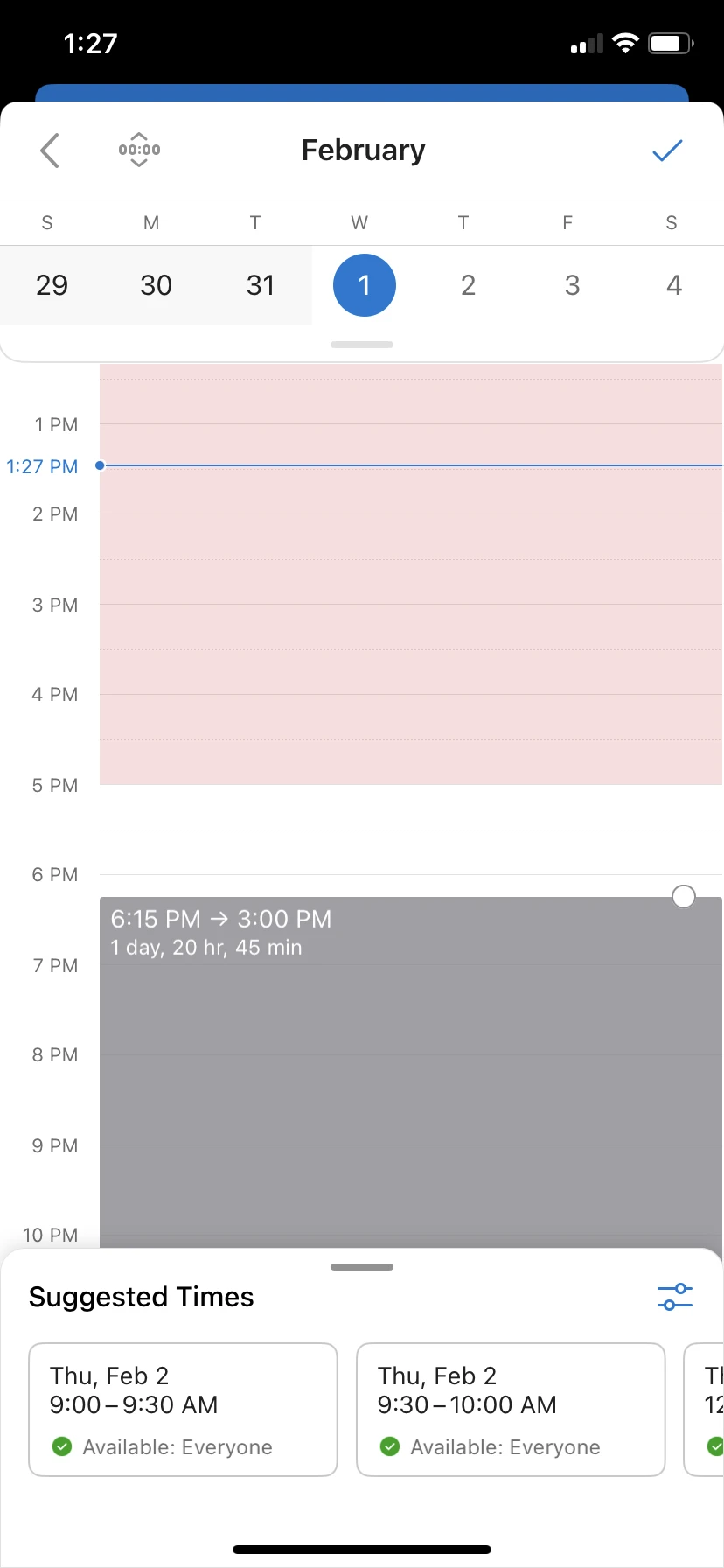
For creating a meeting, Verse will provide the earliest available time based on the chair and invitees’ schedule.
The chair can choose meeting duration, and whether does the suggested times are fit for all invitees or only required invitees.
For creating a meeting, Verse will provide the earliest available time based on the chair and invitees’ schedule.
The chair can choose meeting duration, and whether does the suggested times are fit for all invitees or only required invitees.


Schedule Visualizer
Schedule Visualizer
When the chair clicks 'Find a time' button, the screen shows schedule visualizer where the chair can view own calendar events and the invitees' availability. If the user moves the time cell, it shows participants' availability (including the chair).
When the chair clicks 'Find a time' button, the screen shows schedule visualizer where the chair can view own calendar events and the invitees' availability. If the user moves the time cell, it shows participants' availability (including the chair).


Required Invitees Filter and Invitees List
Required Invitees Filter and Invitees List
In case the chair has to schedule company wise meeting where there are 30+ invitees while the executive’s availability is most important, then the chair can get Suggested Times and view schedule availability only for the Required Invitees (Executives).
In case the chair has to schedule company wise meeting where there are 30+ invitees while the executive’s availability is most important, then the chair can get Suggested Times and view schedule availability only for the Required Invitees (Executives).
Responsive in landscape mode and tablet screen
Responsive in landscape mode
and tablet screen
Verse mobile app is available in phone and tablet. Whether it is in portrait or landscape, the users will have no problem accessing full features we provide.
Verse mobile app is available in phone and tablet. Whether it is in portrait or landscape, the user should have no problem accessing full features.


Let me know if you have any question!
Let me know if you have any question!
Let me know if you have any question!

Background
Above is screenshots of HCL Notes and iNotes Contacts UI. They appeared outdated and were not user-friendly. They had too many unnecessary input fields and outdated features inherited from the 1980s Lotus Notes which significantly affected the usability of the Contacts app and made the interface cluttered.
My mission was to improve the usability and interface design of HCL Verse Contacts while preserving its functionality and data integrity from Notes and iNotes.
Competitor analysis
As the next step, I conducted market research of other mail and calendar software that also has integrated Contacts app. I studied user experience, workflow and feature integration of Microsoft Outlook and Google Workspace. Below are the screenshots that I collected as the reference.


Microsoft Outlook
Strenghts
-Outlook Contacts seamlessly integrates with the Microsoft Outlook Mail and Calendar.
-Advanced features like Contact List and Group Contacts.
-Compatibility with MS 360 platform;
Groups can be shared for other MS apps such as Teams and Planner for project/ task planning.
Weaknesses
-The interface of Outlook maybe overwhelming for some users, especially those who doesn't use much of advanced features.
-The keyboard navigation steps were not intuitive when the user is moving from the action bar to list of saved contacts.

Google Workspace
Strenghts
-Simplicity and ease of use; Google Contacts has a clean and intuitive interface.
-Seamless integration with Mobile devices providing cohesive user experience and convenient user workflow to access the contacts in mobile devices.
Weaknesses
Weaknesses
-While Google Contacts offers essential contact management features, it may lack some of the more advanced features.
Background
Above is screenshots of HCL Notes and iNotes Contacts UI. They appeared outdated and were not user-friendly. They had too many unnecessary input fields and outdated features inherited from the 1980s Lotus Notes which significantly affected the usability of the Contacts app and made the interface cluttered.
My mission was to improve the usability and interface design of HCL Verse Contacts while preserving its functionality and data integrity from Notes and iNotes.
Competitor analysis
As the next step, I conducted market research of other mail and calendar software that also has integrated Contacts app. I studied user experience, workflow and feature integration of Microsoft Outlook and Google Workspace. Below are the screenshots that I collected as the reference.
Microsoft Outlook
Strenghts
-Outlook Contacts seamlessly integrates with the Microsoft Outlook Mail and Calendar.
-Advanced features like Contact List and Group Contacts.
-Compatibility with MS 360 platform;
Groups can be shared for other MS apps such as Teams and Planner for project/ task planning.
Weaknesses
-The interface of Outlook maybe overwhelming for some users, especially those who doesn't use much of advanced features.
-The keyboard navigation steps were not intuitive when the user is moving from the action bar to list of saved contacts.
Google Workspace
Strenghts
-Simplicity and ease of use; Google Contacts has a clean and intuitive interface.
-Seamless integration with Mobile devices providing cohesive user experience and convenient user workflow to access the contacts in mobile devices.
Weaknesses
Weaknesses
-While Google Contacts offers essential contact management features, it may lack some of the more advanced features.